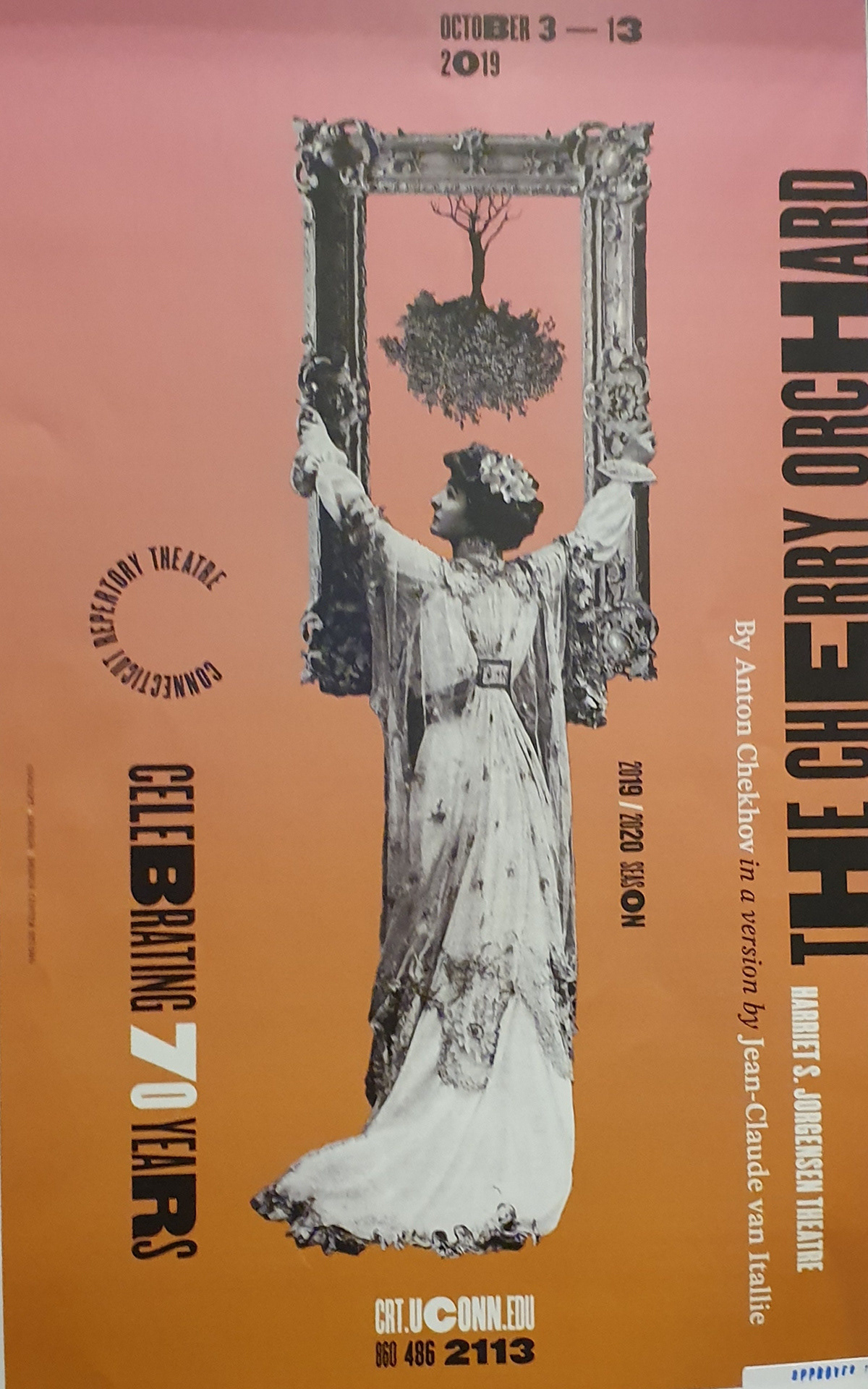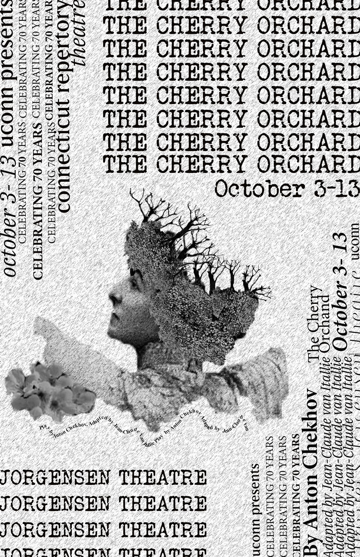
The purpose of this project was to redesign an original poster. I chose a poster that is about the play "The Cherry Orchard" that was performed by the Connecticut Repertory Theater at the Jorgensen Theater. The design of the original poster is very unique and artsy, however, it is difficult to indicate the information since the text is placed sideways and around in a circular pattern. My main goal of redesigning this poster is to make the important information stands out . Since the play, "The Cherry Orchard"is adapted from a book published by Anton Chekhov in 1903, I want to make my poster as a homage to the fonts and prints used in the old period. I got my inspiration from old English newspapers and magazines to recreate this semi-vintage design, that's why I decided to stick to the monochromatic tone/color scheme and old serif fonts. The fonts that I mostly use is Times New Roman, serifs and the typewriter font. I enlarged the title, place and date of the play to make it stick out, which can help readers focus more on the important details. I also incorporated the pen path tool and created a little curvy text design, adding a bit of movement within the design.
Left: the original poster, Right: the redesigned version